library(data.table)
library(ggplot2)
library(knitr)
library(magick)
Linking to ImageMagick 6.9.12.93
Enabled features: cairo, fontconfig, freetype, heic, lcms, pango, raw, rsvg, webp
Disabled features: fftw, ghostscript, x11library(reticulate)Alex Wainwright
May 19, 2024
Probably not. But today, we’ll do just that using the TidyTuesday coffee survey data. By applying exploratory data analytic techniques, we can uncover patterns and gain interesting insights without resorting to complex models.
Linking to ImageMagick 6.9.12.93
Enabled features: cairo, fontconfig, freetype, heic, lcms, pango, raw, rsvg, webp
Disabled features: fftw, ghostscript, x11coffee_stain <-
image_read("imgs/coffee_stain.png") |>
as.raster()
coffee_stain_two <-
image_read("imgs/coffee_stain_two.png") |>
as.raster()
coffee_stain_drip <-
image_read("imgs/coffee_stain_drip.png") |>
as.raster()
coffee_stain_drip_two <-
image_read("imgs/coffee_stain_drip_two.png") |>
as.raster()We start with exploring the gender variable. Table 1 shows the sample to mainly consist of those who identify as male. What we know is that the data was collected during a YouTube Live Stream. According to statista, as of January 2024, 54.4% of Youtube users identify as Male (45.6% Female). Therefore, there is a slight skew with regard to gender across the platform. This may go someway in explaining the gender breakdown in Table 1. However, the skew we see here is not comparable. It’s possible that coffee channels attract a more male audience compared to other YouTube categories. There’s some interesting discussions of demographic breakdowns of YouTube channels here. Going forwards, it is important to remember that any insight would not be representative of the wider population.
Next we look at age. Table 2 shows 25 to 34 year olds to make up most of the sample, followed by 35 to 44 year olds. This is in-line with overall engagement across YouTube. However, the proportion of 25-34 year olds is over 2 times higher for the coffee channel. It is important to remember that the survey was conducted during a live stream and statistics show YouTube Live usage to be highest amongst 18-34 year olds. With this additional context, we have a better understanding of why ~50% of the coffee survey was completed by 25 to 34 year olds.
With remote/hybrid working, spending money on coffee in shops has likely reduced. A survey item asks the individual about their approach to working (remote/hybrid/in-person). We also have the amount an individual spends on coffee within a month.
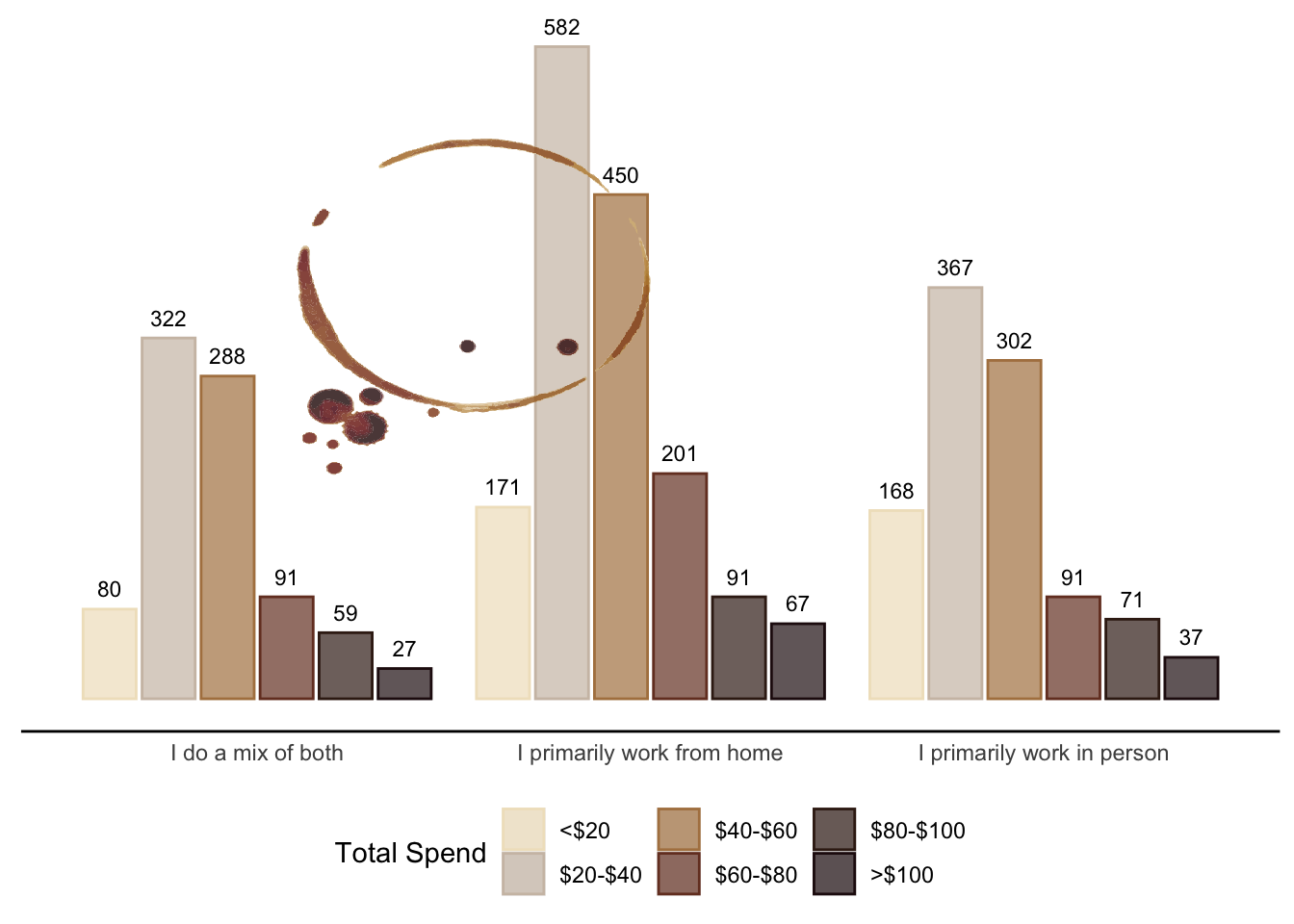
Figure 1 shows the distribution of monthly coffee spending across different work-from-home statuses. Regardless of work location preference, spending $20-$40 a month on coffee is the most common, followed by spending $40-$60 a month.
If an average cup of coffee in a shop costs ~$4.90, spending $40 a month would buy about r floor(40/4.9), whilst spending $60 a month would but about r floor(60/4.9) cups. Thus, an additional $20 a month buys 4.
In contrast, a home-brewed cup of coffee costs approximately $0.26. Therefore, $40 spent on home-brewed coffee would yield about 153 cups, and $60 would yield about 230 cups. An added 77 cups.
wfh_spend <-
  py$wfh_spend |>
  as.data.table()

wfh_spend[, total_spend := factor(
  total_spend,
  levels = c("<$20",
             "$20-$40",
             "$40-$60",
             "$60-$80",
             "$80-$100",
             ">$100"),
  ordered = T
)]

wfh_spend |>
  ggplot(aes(x = wfh, y = N)) +
  geom_bar(
    aes(
      colour = total_spend,
      fill = total_spend
    ),
    alpha = .7,
    position = position_dodge2(),
    stat = "identity"
  ) +
  geom_text(
    aes(
      label = N,
      group = total_spend
      ),
    size = 3,
    vjust = -.8,
    position = position_dodge2(width = .9)
  ) +
  labs(
    x = NULL,
    y = NULL,
    colour = "Total Spend",
    fill = "Total Spend"
  ) +
  scale_colour_manual(
    values = c(
      "<$20" = "#F0E2C5",
      "$20-$40" = "#CEC0B2",
      "$40-$60" = "#B0814F",
      "$60-$80" = "#753D29",
      "$80-$100" = "#3B2117",
      ">$100" = "#240C10"
    )
  ) +
  scale_fill_manual(
    values = c(
      "<$20" = "#F0E2C5",
      "$20-$40" = "#CEC0B2",
      "$40-$60" = "#B0814F",
      "$60-$80" = "#753D29",
      "$80-$100" = "#3B2117",
      ">$100" = "#240C10"
    )
  ) +
  theme(
    axis.line.x = element_line(),
    axis.text.y = element_blank(),
    axis.ticks = element_blank(),
    panel.background = element_rect(colour = "white",
                                    fill = "white"),
    legend.position = "bottom",
    legend.title.align = 1
  ) +
  annotation_raster(coffee_stain_two, 1.1, 2, 200, 500)
The distribution of raw counts helps visualise coffee expenditure across work-from-home statuses. However, using absolute values doesn’t help for making comparisons across groups. To address this, we use proportions (Table 3). Generally, coffee expenditure is comparable across groups, with majority spending between $20-$60. Interestingly, individuals working from home are more likely to spend $60-$80 on coffee than others. This could be because they can obtain more cups of coffee at home and may choose to spend more on premium coffee.
wfh_spend[, proportion := round(N / sum(N) * 100), by = "wfh"] |>
  dcast(
    wfh ~ total_spend,
    value.var = "proportion"
  ) |>
kable()| wfh | <$20 | $20-$40 | $40-$60 | $60-$80 | $80-$100 | >$100 |
|---|---|---|---|---|---|---|
| I do a mix of both | 9 | 37 | 33 | 10 | 7 | 3 |
| I primarily work from home | 11 | 37 | 29 | 13 | 6 | 4 |
| I primarily work in person | 16 | 35 | 29 | 9 | 7 | 4 |
If people mainly work from home, we may assume they’d spend more on coffee equipment.
wfh_equipment_spend  = (
  coffee_survey
  .groupby(["wfh", "spent_equipment"])
  .agg(
    N=pd.NamedAgg("spent_equipment", "count")
  )
)

wfh_equipment_spend = (
  wfh_equipment_spend
  .div(
    wfh_equipment_spend.groupby(level=0).sum(),
    level=0
    )
  .multiply(100)
  .round(1)
  .reset_index()
  .pivot(
    index="wfh",
    columns="spent_equipment",
    values="N"
  )
  .reset_index()
)
Table 4 shows coffee equipment expenditure across work-from-home statuses. Spending $100-$300 on coffee equipment is most common for both hybrid and in-person workers. Interestingly, those who primarily work from home are more likely to invest over $1000 on coffee equipment.
wfh_equipment_spend <-
  as.data.table(py$wfh_equipment_spend)

kable(wfh_equipment_spend[, c(1,7,3,5,2,4,6,8)])| wfh | Less than $20 | $20-$50 | $50-$100 | $100-$300 | $300-$500 | $500-$1000 | More than $1,000 |
|---|---|---|---|---|---|---|---|
| I do a mix of both | 5.5 | 5.1 | 9.2 | 23.6 | 16.1 | 19.5 | 20.9 |
| I primarily work from home | 5.7 | 5.2 | 7.1 | 20.4 | 17.9 | 18.0 | 25.7 |
| I primarily work in person | 9.2 | 6.0 | 11.2 | 20.8 | 16.5 | 17.9 | 18.5 |
Ok, so we know a lot about spending habits now. Let’s move on to preferences.
The survey has a few variables that could be interesting to explore. These are:
Number of cups of coffee drunk within a day.
Favourite coffee drink.
Coffee Strength.
Response options for number of coffees per day range from “Less than 1” to “More than 4”. The meaning of “less than 1 coffee per day” is unclear – it might refer to an average over a week. Perhaps it’s an average over a week. It's unlikely that someone drinking no coffee would participate in a coffee survey during a YouTube Live Stream, which would be quite niche.
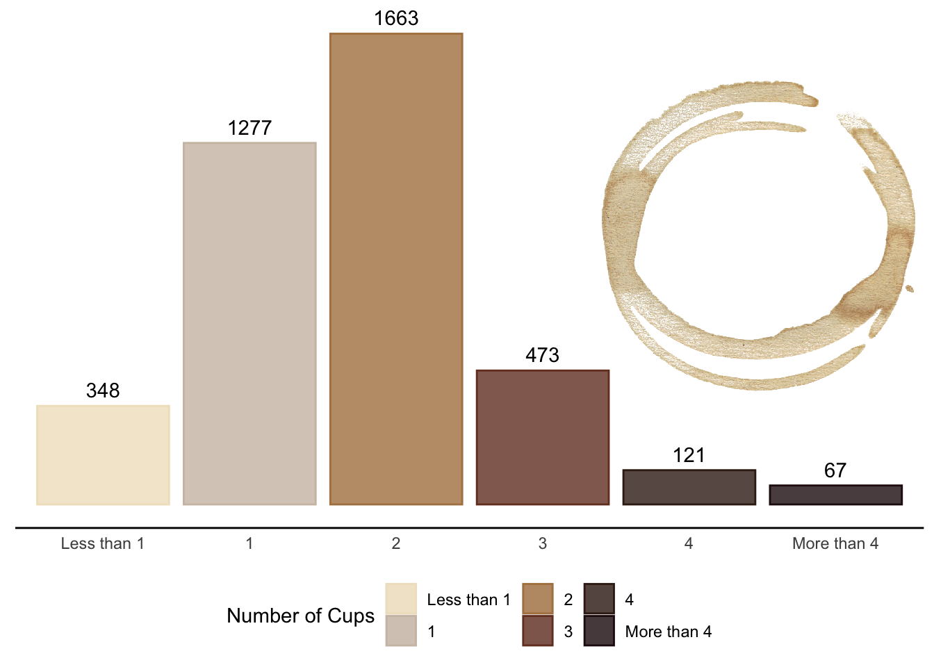
The most common response option is 2 cups of coffee per day, as per Figure 2. This is closely followed by 1 cup per day. Drinking 4 or more coffees is less common among respondents. According to Statista, 80% of US coffee drinkers consume 2 or more cups per day, which aligns with the survey findings.
no_cups <-
  py$no_cups |>
  as.data.table()

no_cups[, cups := factor(
  cups,
  levels = c(
    "Less than 1",
    "1",
    "2",
    "3",
    "4",
    "More than 4"
  ),
  order = TRUE
)]

no_cups |>
  ggplot(aes(x = cups, y = N)) +
  geom_col(
    aes(
      colour = cups,
      fill = cups
    ),
    alpha = .8
  ) +
  geom_text(
    aes(
      label = N
    ),
    vjust = -.6
  ) +
  labs(
    x = NULL,
    y = NULL,
    colour = "Number of Cups",
    fill = "Number of Cups"
  ) +
  scale_colour_manual(
    values = c(
      "Less than 1" = "#F0E2C5",
      "1" = "#CEC0B2",
      "2" = "#B0814F",
      "3" = "#753D29",
      "4" = "#3B2117",
      "More than 4" = "#240C10"
    )
  ) +
  scale_fill_manual(
    values = c(
      "Less than 1" = "#F0E2C5",
      "1" = "#CEC0B2",
      "2" = "#B0814F",
      "3" = "#753D29",
      "4" = "#3B2117",
      "More than 4" = "#240C10"
    )
  )  +
  theme(
    axis.line.x = element_line(),
    axis.text.y = element_blank(),
    axis.ticks = element_blank(),
    panel.background = element_rect(colour = "white",
                                    fill = "white"),
    legend.position = "bottom",
    legend.title.align = 1
  ) +
  annotation_raster(coffee_stain, 4.4, 6.7, 400, 1500)
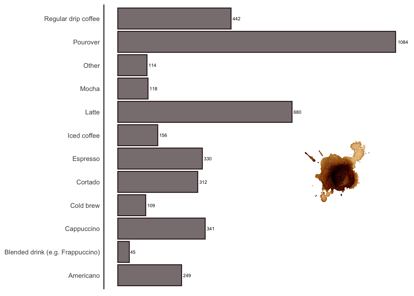
Pourover coffee is the most favoured type among survey respondents (Figure 3), while blended drinks appear to be the least popular. Although I don’t watch this YouTube channel, a quick scan of its videos suggests that the content is quite specialised, focusing on product reviews and brewing techniques. This might explain the preference for pourover coffee over blended drinks among its audience.
coffee_preference[variable == "favorite"] |>
  ggplot(aes(x = value, y = N)) +
  geom_col(
    alpha = .6,
    colour = "#240C10",
    fill = "#240C10"
  ) +
  geom_text(
    aes(
      label = N
    ),
    hjust = -.2,
    size = 2
  ) +
  coord_flip() +
  labs(
    x = NULL,
    y = NULL,
    colour = "Number of Cups",
    fill = "Number of Cups"
  ) +
  theme(
    axis.line.y = element_line(),
    axis.text.x = element_blank(),
    axis.text.y = element_text(
      size = 8
    ),
    axis.ticks = element_blank(),
    panel.background = element_rect(colour = "white",
                                    fill = "white")
  ) +
  annotation_raster(
    coffee_stain_drip, 4, 7, 700, 1000
  )
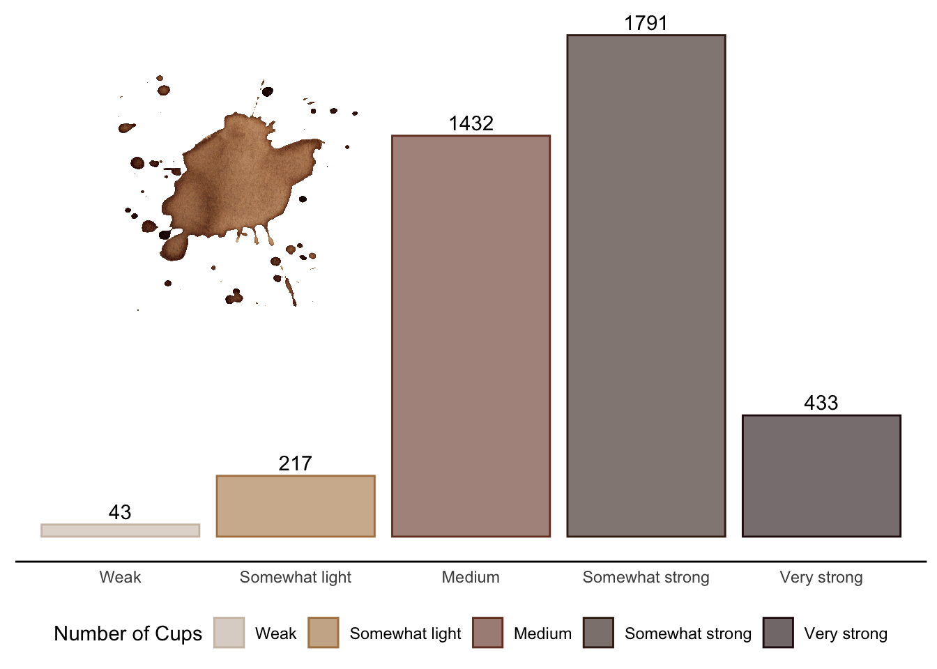
Knowing that the preferred coffee is Pourover, it is of no surprise that the audience prefers a “Somewhat strong” coffee (Figure 4). Pourover enthusiasts may favor an intense flavor profile, which is often achieved with higher strength coffee.
coffee_strength <-
  coffee_preference[variable == "strength"]

coffee_strength[, value := factor(
  value,
  levels = c(
    "Weak",
    "Somewhat light",
    "Medium",
    "Somewhat strong",
    "Very strong"
  )
)]

coffee_strength |>
  ggplot(aes(x = value, y = N)) +
  geom_col(
    aes(
      colour = value,
      fill = value
    ),
    alpha = .6
  ) +
  geom_text(
    aes(
      label = N
    ),
    vjust = -.4
  )  +
  labs(
    x = NULL,
    y = NULL,
    colour = "Number of Cups",
    fill = "Number of Cups"
  ) +
  scale_colour_manual(
    values = c(
      "Weak" = "#CEC0B2",
      "Somewhat light" = "#B0814F",
      "Medium" = "#753D29",
      "Somewhat strong" = "#3B2117",
      "Very strong" = "#240C10"
    )
  ) +
  scale_fill_manual(
    values = c(
      "Weak" = "#CEC0B2",
      "Somewhat light" = "#B0814F",
      "Medium" = "#753D29",
      "Somewhat strong" = "#3B2117",
      "Very strong" = "#240C10"
    )
  )  +
  theme(
    axis.line.x = element_line(),
    axis.text.y = element_blank(),
    axis.ticks = element_blank(),
    panel.background = element_rect(colour = "white",
                                    fill = "white"),
    legend.position = "bottom",
    legend.title.align = 1
  ) +
  annotation_raster(
    coffee_stain_drip_two, .5, 2.5, 800, 1700
  )
As a final step, let’s dive into comparing the preferences of those who favor Pourover or Latte. We’ll examine the number of cups consumed per day and the preferred strength of coffee.
favourite_filter = (
  coffee_survey
  .loc[
    coffee_survey["favorite"].isin(["Pourover", "Latte"]),
    ["favorite", "cups", "strength"]
  ]
)

# Favourite Coffee Number of Cups

favourite_cup_count = (
  favourite_filter
  .groupby(["favorite", "cups"])
  .agg(
    N=pd.NamedAgg("cups", "count")
  )
)

favourite_cup_count = (
  favourite_cup_count
  .div(favourite_cup_count.groupby(level=0).sum())
  .multiply(100)
  .round(2)
  .pivot_table(
    index="favorite",
    columns="cups",
    values="N"
  )
  .reset_index()
)

# Favourite Coffee Strength Preference

favourite_strength_count = (
  favourite_filter
  .groupby(["favorite", "strength"])
  .agg(
    N=pd.NamedAgg("strength", "count")
  )
)

favourite_strength_count = (
  favourite_strength_count
  .div(favourite_strength_count.groupby(level=0).sum())
  .multiply(100)
  .round(2)
  .pivot_table(
    index="favorite",
    columns="strength",
    values="N"
  )
  .reset_index()
)
favourite_cup_count <-
py$favourite_cup_count |>
as.data.table()
kable(
favourite_cup_count[, c(1,6,2,3,4,5,7)]
)| favorite | Less than 1 | 1 | 2 | 3 | 4 | More than 4 |
|---|---|---|---|---|---|---|
| Latte | 13.54 | 41.82 | 35.27 | 7.59 | 1.34 | 0.45 |
| Pourover | 3.46 | 27.90 | 50.00 | 13.95 | 3.09 | 1.59 |
favourite_strength_count <-
  py$favourite_strength_count |>
  as.data.table()

kable(
  favourite_strength_count[, c(1,6,3,2,4,5)]
)| favorite | Weak | Somewhat light | Medium | Somewhat strong | Very strong |
|---|---|---|---|---|---|
| Latte | 2.23 | 7.88 | 41.90 | 39.38 | 8.62 |
| Pourover | 0.09 | 5.82 | 40.28 | 45.07 | 8.73 |
In this section, we observe that Pourover drinkers tend to consume more coffee per day compared to Latte drinkers, with a higher proportion consuming 2 or more cups daily (Table 5). Regarding strength, Pourover fans show a stronger preference for “Somewhat strong” coffee, aligning with the brewing method’s emphasis on a robust flavor profile (Table 6). Latte drinkers, however, lean slightly more towards “Medium” strength, likely due to the milk-based nature of the drink which can dilute the coffee’s intensity.
This exploratory data analysis reveals intriguing patterns about the coffee preferences and habits of YouTube Live Stream viewers. The findings indicate a strong preference for Pourover coffee among the audience, likely due to the specialised content of the channel focusing on detailed brewing techniques and product reviews. Additionally, Pourover enthusiasts tend to prefer “Somewhat strong” coffee, emphasizing a robust and intense flavor profile.
When comparing Pourover and Latte drinkers, it’s evident that Pourover fans consume more coffee daily and prefer stronger coffee. In contrast, Latte drinkers favor a medium strength, which complements the milk-based nature of their preferred beverage.
Regarding work-from-home preferences, there is a tendency for remote workers to make larger investments in both coffee and equipment. It would be interesting to expand this further by exploring the motivation behind why each group grabs a coffee. For instance, remote workers might consume coffee as a form of procrastination; whereas, hybrid workers may drink coffee in a more social manner.