library(data.table)
library(ggplot2)
library(knitr)I’ve migrated over to Quarto for the purposes of blogging. This has resulted in a loss of old posts. Therefore, I’m starting over from scratch with an initial post of articles I scraped from a local news outlet.
article_content <-
    fread("data/local_news_archive.csv")

article_content[,
  article_year := format.Date(ARTICLE_DATE_TIME, "%Y")
]

article_content[,
  article_date_time_rounded := format.Date(ARTICLE_DATE_TIME, "%Y-%m-%d")
]

article_content <-
  article_content[!is.na(ARTICLE_DATE_TIME)]
Article Counts
article_counts_year <-
  article_content[,
                .(N = .N),
                by = "article_year"]
We can start by exploring the number of articles published per year to see whether there are any trends.
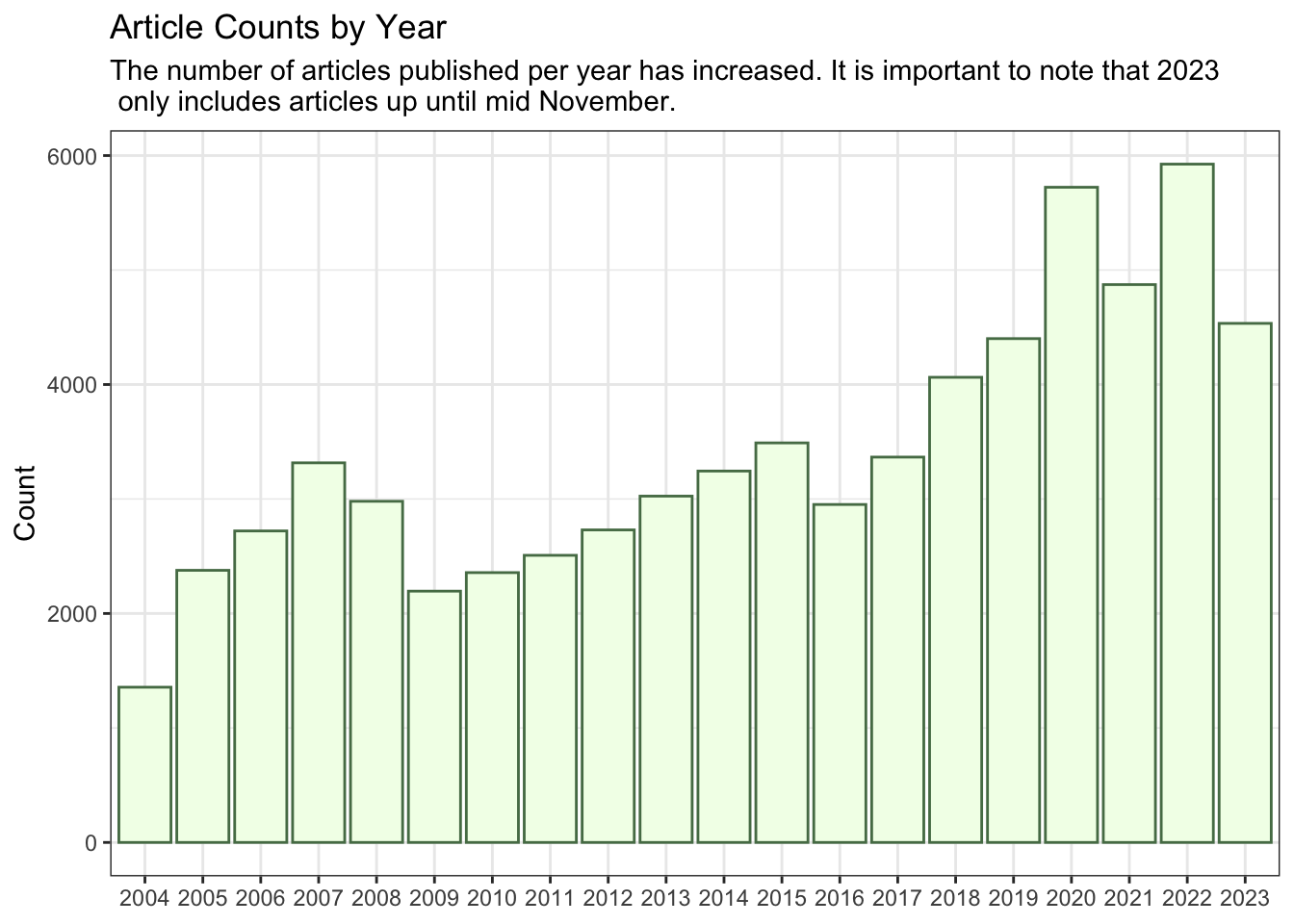
The earliest year we have is 2004 and the most recent year is, obviously, 2023. The article counts for each year were 1356 and 4534, respectively. This equates to a 234.4% increase in articles published. One likely explanation for this sharp rise is the shift away from print media. In 2004, articles were probably more commonly published in print rather than on the website. Over time, this dynamic changed as print media gave way to digital platforms, leading to the observed increase in article counts.
The ensuing plot substantiates the previously mentioned explanation, revealing a discernible upward trend from 2004 to 2015. This trajectory not only persists beyond 2015 but becomes more pronounced.
article_counts_year |>
  ggplot(aes(x = article_year,
             y = N)) +
  geom_col(colour = "#557C55",
           fill = "#F2FFE9") +
  labs(
    x = NULL,
    y = "Count",
    title = "Article Counts by Year",
    subtitle = "The number of articles published per year has increased. It is important to note that 2023\n only includes articles up until mid November."
  ) +
  theme_bw()
Looking at article publications by year offered some insights, but it can be expanded upon by exploring publications at a more granular level. We do that next.
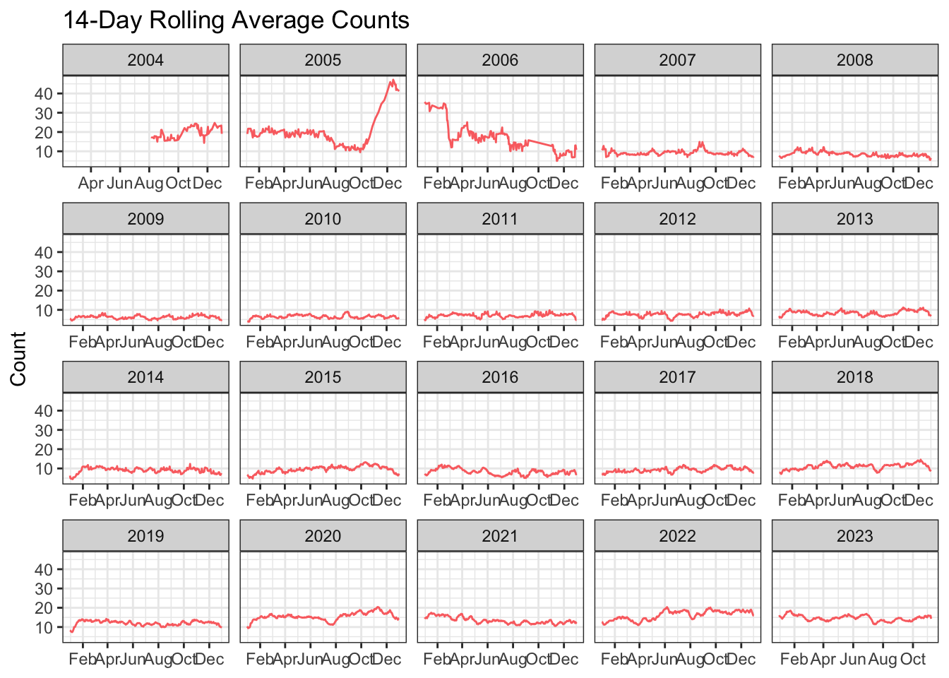
As opposed to raw counts, we can look at rolling averages (14 days in this case) for article publications. A rolling average is used to smooth out the trends, which could otherwise be distorted by short-term fluctuations.
As we can see from the plot from around 2007 onward, publications throughout the year are relatively stable and rarely exceed 20 publications on average. Other notable points to consider are 2004 and the latter part of 2005/start of 2006. Regarding 2004, it is clear that only articles for part of the year were available and subsequently extracted. As for 2005 and 2006, there isn’t a reason that we can immediately discern that could explain the large fluctuations in counts. We leave this for the next post.
article_counts <-
  article_content[, .(N = .N), by = c("article_date_time_rounded", "article_year")]

setorder(article_counts, article_date_time_rounded)

article_counts_rolling_averages <-
  article_counts[, rolling_count_avg := frollmean(N, n = 14)]

article_counts_rolling_averages |>
  ggplot(aes(x = as.Date(article_date_time_rounded),
             y = rolling_count_avg,
             group = article_year)) +
  geom_line(colour = "#FA7070") +
  labs(x = NULL,
       y = "Count",
       title = "14-Day Rolling Average Counts") +
  scale_x_date(date_breaks = "2 months",
               date_labels = "%b") +
  theme_bw() +
  facet_wrap(~article_year,
             scales = "free_x")