Overview
I built an ETL (Extract, Transform, Load) process and a dashboard to visualise train service performance!
Background
I’ve spent several months exploring ETL projects that align with my interests. During this period, I discovered the complex performance reporting of Northern Rail. Much of their data is buried within PDF files and HTML tables, making it cumbersome to navigate and challenging to view in a single, cohesive location. To address this issue, I developed an ETL process that extracts data from these sources (PDF and HTML), transforms and standardises it, and loads it into a user-friendly dashboard.
The Challenge
Northern Rail’s performance data was fragmented and difficult to access. PDFs and HTML tables contained vital information but were not designed for easy data extraction or analysis. This fragmentation led to the need for a robust ETL process to consolidate and streamline the data.
The Solution
By building a custom ETL pipeline, I was able to automate the extraction of data from PDFs and HTML tables, transform the data into a standardised format, and load it into a dashboard built with R Shiny. The resulting dashboard provides clear visualisations that make it easy to monitor and analyse train service performance metrics.
ETL Process
Extraction
The data contained on the performance page is in both HTML tables and PDFs. Extracting HTML data was achieved using BeautifulSoup. For PDFs, PyPDF2 was used. Here’s the code used to extract data from the on-time graph:
def on_time_graph_text(pdf_text: str) -> pd.DataFrame:
    """Extract the On-Time Graph Text

    Keyword Arguments:
    pdf_text -- The raw text from the On-Time PDF
    """
    on_time_data = dict()

    pdf_text = pdf_text[0].splitlines()

    # Extract Report Start and End Dates
    report_date = pdf_text[0]
    start_date, end_date = [date.strip() for date in report_date.split("to")]
    start_date = start_date.replace("From", "").strip()

    # Extract Report Percentages
    pattern_two_digits = r"(\d{2}\.\d)"
    pattern_one_digit = r"(\d{1}\.\d)"

    matches_two_digits = re.findall(pattern_two_digits, pdf_text[1])
    matches_one_digit = re.findall(pattern_one_digit, pdf_text[2])

    percentages = matches_two_digits + matches_one_digit

    # Ensure the correct number of percentages is extracted
    if len(percentages) < 10:
        raise ValueError("Not enough percentage values found")

    percentage_labels = [
        'Early', 'On Time', 'Within 3 mins', 'Within 5 mins', 'Within 10 mins',
        'Within 15 mins', '15 mins +', '20 mins +', '30 mins +', 'Cancelled']

    percentage_with_label = zip(percentage_labels, percentages)

    # Output to JSON
    on_time_data["start_date"] = start_date
    on_time_data["end_date"] = end_date

    for percentage_label in percentage_with_label:
        label, percentage = percentage_label
        on_time_data[label] = percentage

    on_time_data = pd.DataFrame(on_time_data, index=[0])

    return on_time_data
Transformation
The majority of the data was clean. Minor cleansing was applied in areas such as converting percentages from strings to float types.
WITH PERIOD_PERFORMANCE AS (
    SELECT COMPONENT,
           AREA,
           DATE AS PERIOD_DATE_RANGE,
           IIF(
            LENGTH(DATE) = 21,
            DATE(20 || SUBSTR(DATE, 9, 2) || '-' || SUBSTR(DATE, 4, 2) || '-' || SUBSTR(DATE, 1, 2)),
            DATE(20 || SUBSTR(DATE, 7, 2) || '-' || SUBSTR(DATE, 4, 2) || '-' || SUBSTR(DATE, 1, 2))
            ) AS PERIOD_START_DATE,
           CAST(REPLACE(PERFORMANCE, '%', '') AS FLOAT) AS PERFORMANCE_PRCNT
    FROM SERVICE_QUALITY
)

SELECT *,
       PERFORMANCE_PRCNT - LAG(PERFORMANCE_PRCNT) OVER
            (PARTITION BY COMPONENT, AREA
             ORDER BY PERIOD_START_DATE) AS PERFORMANCE_CHNG,
       AVG(PERFORMANCE_PRCNT) OVER (
            PARTITION BY COMPONENT, AREA
            ORDER BY PERIOD_START_DATE
            ROWS BETWEEN 3 PRECEDING AND CURRENT ROW) AS AVG_PERFORMANCE_PRCNT
FROM PERIOD_PERFORMANCE;
Loading
Transformed data was then loaded into a SQLite database, which sits behind the dashboard.
Dashboard
R Shiny was used to build the dashboard, in conjunction with the bslib package to use Bootstrap.
Service Performance
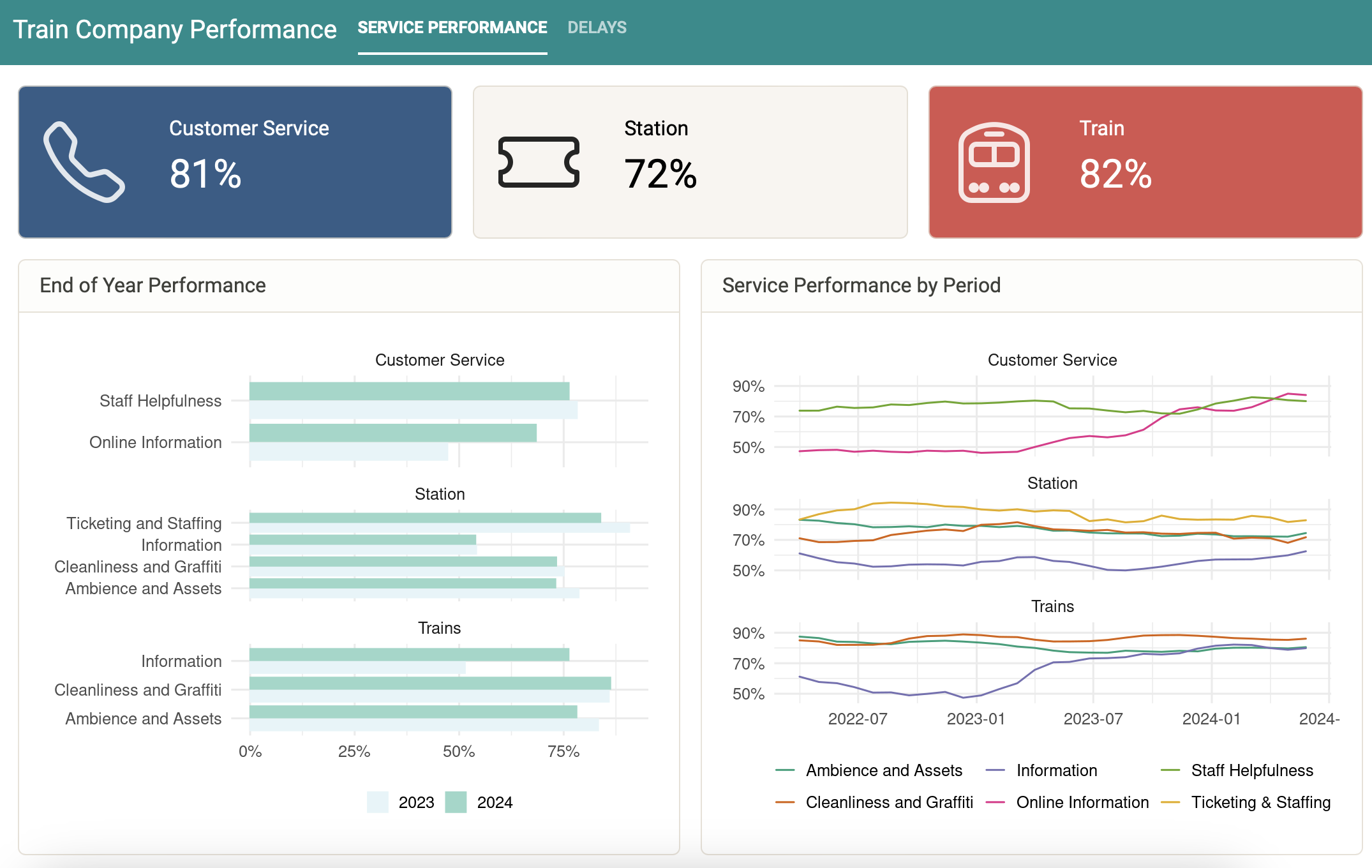
The first tab presents service performance information. Value boxes are used to present the average performance for the three overarching performance areas within the current year. End-of-year performance presents the year-on-year performance rating for each area component. Service performance by period presents the performance ratings for each reporting period, again broken down by area and component.

Delays
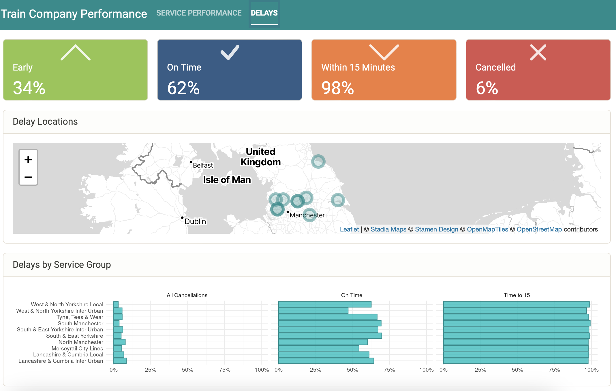
Value boxes are used to present the average delay performances for the current year. For example, 34% of trains in 2024 were early and 6% were cancelled. Delay locations present the location of notable delays that occurred during the time period. Finally, delays by service group allow users to compare how different areas compare in relation to delays.

Summary
This project demonstrates the power of an ETL process combined with a user-friendly dashboard to transform complex data into actionable insights. The R Shiny dashboard allows for easy monitoring and analysis of train service performance, making it a valuable tool for both operators and passengers. Although being dependent on the data from a non-standardised PDF report means it could break on the next update…